I get asked almost 2-3 times a month these days for an interview from an illustration or design student. I recently filled out a 22 question email interview and thought I would share it here.
1. Where are you from? The surrounding suburbs of Atlanta, GA.
2. How long have you done illustration for? All my life, but professionally for 12+ years.
3. How did you find out that illustration was something you wanted to pursue? After I graduated from LaGrange College with a BA in Drawing a Painting and Graphic Design I did not really know how to go about making a living as a freelance illustrator until I went to Portfolio Center (PC) in 1992 and saw all the illustration sourcebooks and trade magazine and talked with my professors. I wanted to do art but I thought gallery work was too unstable and I did not mind illustrating other peoples ideas so Illustration was more stable and appealing to me. Some would say I “sold out” by going into commercial art, but everyone got to make a living and I make a living doing what I love.
4. What was your first job as an illustrator? I had small rinky dink jobs in high school and college, but my first big break as an educated illustrator came while I was in my 5th of 8 quarters at PC. A teacher at PC who taught advertising by the name of Mike Weed of Henderson Advertising saw an illustration I did on the walls of PC that won best of show and thought I could take on an two illustrations he needed for Flowers Bread Company. They were two billboard illustrations. http://www.jaymontgomery.com/portnaturesown.html I did them for a total of $2500 (I think), so I was thrilled and that job and illustrations lead to so many other freelance opportunities.
5. What college did you attend? LaGrange College and Portfolio Center
6. What illustration did you enjoy doing the most? The ones with the most freedom and money of course. Editorial jobs have a little of both.
7. Which project are you most proud of? I guess the one that I got the most money for which was $13,600 for a Roadway illustration. This is not a normal pricing that most illustrators expect, but it sure is nice.
8. Did you ever have any doubts about being an illustrator? Of course, but I really did not know what else made me happy and challenged so I stuck it out through the tough times. The head of the illustration department at PC told me that I would not make it as an illustrator, which definitely gave me doubts, but I wanted to turn that negative comment into a positive and prove him wrong. I think I did. Also, I had doubts right after 9/11 when I had a 2 year old and a baby and I was the sole income provider doing full-time freelance. Man that was tough!
9. Is this a job you would consider to be very time consuming? Is it hard balancing a family and a job as an illustrator? Absolutely! If you want to be your own boss in any market it will take more time than a full-time cubicle job, mainly because your are every part of the business; customer service, marketer, creator, president, maid, accounts payable, purchaser, manager, etc.
10. How did you go about selling your ideas to a client? Most of the time a basic idea is already formed by a doodle, text or verbal description before the client even contacts me. If they want me to come up with an idea, I’m more than happy to do that by talking with them and getting all the pertinent info, then I do 3-4 inch numbered thumbnails sometimes with a text description beside them. I do anywhere from 2-6 different ideas I send this to them usually via email attachment. Then I get feedback and go tighter.
11. Do you do anything else besides illustration? What are some hobbies that you enjoy doing? With freelance illustration, teaching 3 illustration classes, my family time with my 5-6 year olds, cleaning, eating, taking care of my house and getting an average of 6 hours of sleep 7 days a week there is little time for hobbies. Art IS my hobby I would create art even if I won the lottery.
12. Owning your own business, do you suggest people going into the graphic design field to also pursue a business degree? Or does it just come to you? Is does not just come to you. There is a right and wrong way of doing things and you could go years of doing business tasks a certain way that could be done way more efficient and right if you had at least taken some sort of business class. I business degree might be too much for an illustrator, I would at least take a very concentrated business class or to while still in college. If you want to start your own design firm a business degree would definitely be worth while.
13. Who is your inspiration? Did your parents always approve of your career choice? Actually, early on my older brother was the start of my inspiration by wanting to finally be better than him at just one thing. My parents from the get go always supported me and encouraged me to follow my dreams even though they did not understand completely what my passion was all about. They are not visual artist’s but they can appreciate what I do.
14. What is something you would suggest to a graphic designer graduating straight from college? Build up a network of other graphic designers, illustrators, photographers, writers, etc. of who you can call upon for advice, work, and general support. These maybe other students in you classes or contacts outside of class. You can also do this by joining a trade org like GAG or AIGA.
15. How many illustrations do you do a year? It varies between 50-80 a year. I also do a fair amount of graphic design, production work, and stock art sales.
16. How long does it take to illustrate something for a top client? As quick as 3 days and as longs as 1 month. Most of the time it’s about 2 weeks.
17. What is a subject you enjoy illustrating the most just for fun? Posters for bands, musicians, and lately I have been wanting to do a painting of an octopus lady.
18. Have you accomplished everything you have ever wanted to do? If not, what are some goals you want to accomplish? Absolutely not, I’m always striving for more. I Strive to get 3 $10K jobs a year. Has not happened yet, but I’m thinking long term. I would like to teach full-time a get descent health insurance for me and my family.
19. Do you have any regrets? I wish I would have gotten my Masters in Fine Art or Illustration.
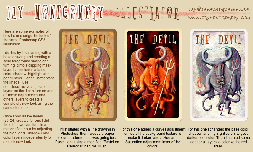
20. What medium do you use the most? Photoshop, Illustrator and Painter. I’m getting back to the traditional stuff from the classes I teach at SCAD.
21. What theme occurs the most in your work? Usually some sort of business concept that’s politically correct. Mainly due to the client’s needs.
22. How would you describe your style of work? Stylized realism or Tradigital.
Thanks for reading,
Jay
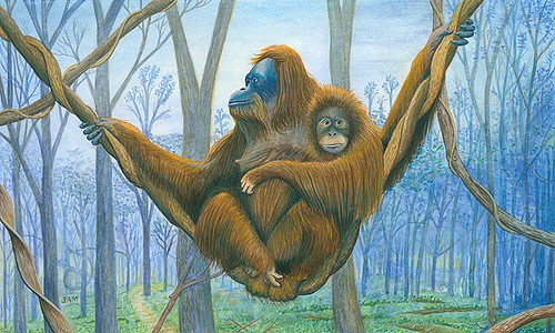
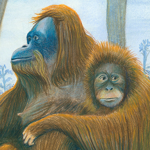
 Acrylic and Ink base colors. Watercolor was used for the clouds that I don't have a picture for.
 Oil wash made with Dioxane Purple and Permanent Green Light thinned with Gamsol.
 Dried oil wash removed with kneaded eraser revealing highlights and unifying shadows.
 Final flatbed scan color corrected with touched off with digital signature.


