Friday, November 14, 2008

Ya Ya Kids T-Shirt Illustrations

Just finished a series of 4 t-shirt illustrations for a new line of clothing geared towards Moms and kids. The company is called Ya Ya Kids. The business model is to have Moms post photos of their kids getting their "ya ya's" out by doing crazy fun things. The visitors to the site and company would then vote on the photos to see which of them gets turned into an illustration used on t-shirt and other apparel. These would then be sold on the web site as well as in retail stores. We are just getting started and have high hopes. The illustrations are at the printer now being printed. Check back for actual pictures of the shirts and updated Ya Ya Kids website so you can buy your own.

After many rounds of concepting we decided to go with a Dick and Jane style applied to modern and sometimes irreverent subject matter. Most the the Dick and Jane illustrator worked in watercolors and white gouache. These watercolors were painted on Ampersand Aquaboard and then were modified slightly in Photoshop to touch up some colors and facial details. These are not the same backgrounds used for the t-shirts. The warm background texture was added in Photoshop. The shirt illustrations were set up to be more of a vignette so they would work on several different colored shirts. I will not post those until the launch of the shirts on the Ya Ya Kids website.


Boyzilla

Loch Mess Monster

Princess Puddle Jumper

Baby On Board


Saturday, November 1, 2008

Carpet Cut-a-way illustration

While SCAD has got me really busy, this month I finished up a Carpet cut-a-way illustration for Dow Chemical. Nothing too terribly exciting but really functional and clear. I had to scan swatches of the actual carpet layers and compose them in a isometric perspective. Created using Illustrator and Photoshop.

Carpet_cutaway72dpi

Carpet_cutaway72dpidetail

Sunday, October 12, 2008

Paperless Office Editorial Illustration

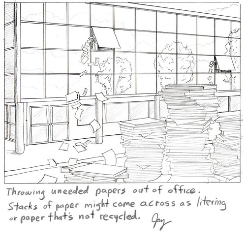
Assignment for a Mortgage Servicing News. Art director's brief description is pretty much all I got: "man in small office building throwing papers out of window.
Pile of paper on the street..." I took it a bit further adding too many details.
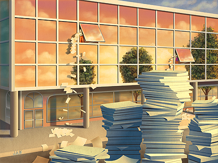
This is the concept that the AD asked for and eventually went with.
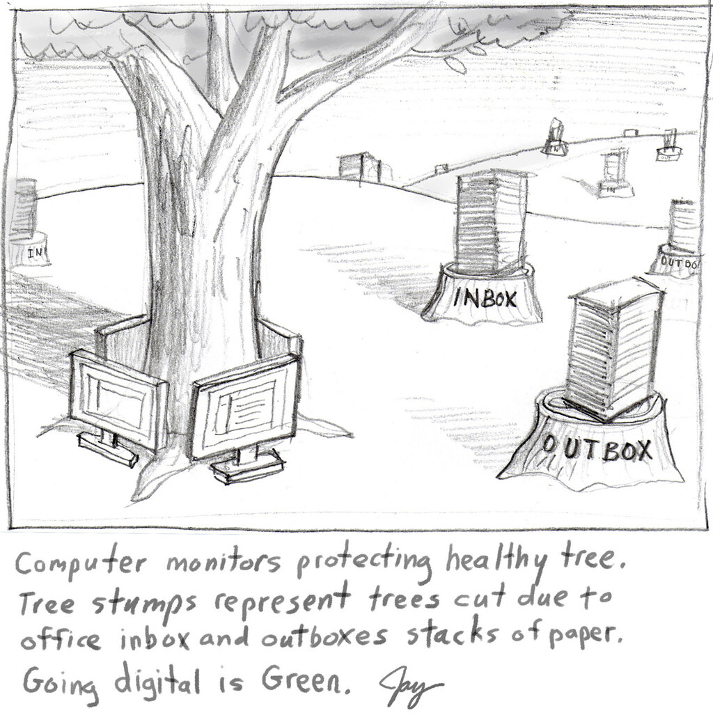
This is another concept that the AD did not ask for but liked better. The editor liked the other requested concept so the AD had to comply. This has happened over and over again with editorial clients. I thought it was the AD's job to pick the artist and the art. Isn't that what they went to school for?

I had originally painted the colors as a normal blue sky day. I liked the way a changed it. After some thumbnail sketches it was totally created on the Mac using Illustrator CS3 most 85% of the shapes and Photoshop for the painted looking parts. Total time: about 10 hours on and off for a week.

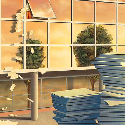
A cropped detail that surprisingly and most frustratingly communicates exactly the same thing as the un-cropped version. I could have done half the work and got paid the same! Arggh!!

Comments good and bad are welcome!

Saturday, October 4, 2008

Flavor Icons

A new potato chip package design that I have recently been working on needed some small flavor icons. This is what I came up with. These chips are going to be sold mainly in vending machines with the potential of them in the stores later.


Tuesday, September 16, 2008

New Book Illustrations

I just finished some book illustrations for the book publisher Winepress Publishing. It's for a book titled "Righteousness and Life From Grace". These are to be used as 2 spots and 3 half page black and white illustrations. As for what they wanted pretty much all I got was this text below, with a few other questions asked. So this is simply how I translated those words into illustrations. It was quite fun to work on but that sure was a lot of people to render. Finals were created in Photoshop at actual print size at 400 dpi.


Saturday, September 13, 2008

Cutaway Illustration

Over the Summer I completed a fairly complicated cutaway of a support structure for railroads. Tensar makes and designs grid systems for various industrial applications. This illustration was about railroad ballast and the slope systems. This was created using mainly Adobe Illustrator and the train is a Poser 3D model. The final was 20"x 16". Now every time I see a railroad, wall system, or slope I will have a much better understanding of how it might be built.


Monday, July 7, 2008

Current Conservation Magazine Cover

This one I'm quite proud of. I did this illustration when I was at Portfolio Center in 1993. Today I got my copy of the latest issue of Conversation Magazine and it's on the cover! I'm really glad to be apart of such a worthy cause. I'm in good company with past covers art as well. Several very well known illustrators have graced the cover and now me. Thanks to Society for Conservation Biology. Also, this has been on another magazine cover and won a Best Cover award back in 1995. An oldie but goodie. Check out some other past magazine covers here.